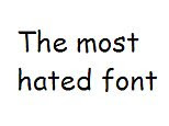
As a designer I have the pleasure of seeing more fonts on a daily basis than I sometimes would like. I see the Arial, the Times New Roman, the Trebuchet MS, and the oh so famous Comic Sans. And that is the topic of our discussion here today.
The creator of Comic Sans, Mr. Vincent Connare, has been put to the front of national news coverage as his font is up for, lack of a better word, banishment from our lives. The font has been used for advertisements, Beanie Baby tags, Microsoft memos, and on billboards, fliers, and signage all over the world since it’s inception in 1994. The font, as you see here, is not one that I would ever suggest using. You can see that it is a sans-serif font that has some character to it.
The design came from Vincent as he was working for Microsoft. He was told that they needed a childish and silly font that they could use for application development for a child based product. And he hit the nail on the head, that’s for sure. This font, childish yes, does not work for the number of places that you find it. It is thrown on systems as a default font (and I am sure Microsoft had something to do with that one) and one that is considered web safe but should never be used.
Vincent said in a statement a while back that if you hate the font, you do not know much about typography. And if you love the font, you don’t know much about typography. Now working for a typography company in London, he stakes claim in creating many more fonts that have roots in the heart of Comic Sans.
But with a recent push from the boys at the top (you know, the decision makers) it is being tossed around that the font will be taken away from us all and for good. And the sad part is, Vincent is not totally against it. He agrees that the font is misused and that people take the meaning out of context. It has almost become a comedic relief for designers as we joke around when trying to find that perfect font but can’t.
I want to touch base, though, for a second on how hard it truly is to one, find that perfect font, but to create fonts. If you think about it, that might be one of the most powerful tools in our arsenal, as designers, and at the same time the one that is taken most for granted. You can tell a story and convey a message without type, sure, but it aids in every way possible.
Have you ever tried to create a font? It is not an easy task. Think about it for a second. You have to create every letter of the alphabet. You have to create all the numbers from 0-9. You have to create the : , ” [ } and all the other characters you see on your keypad. Then, let’s say you want an option to have those bold. Or able to be placed in italics. (For those CSS geeks out there, it it no longer considered proper to say italics. It is now to be referred to as being emphasized. Or em for short.)
You can download trial versions of font creators. I highly suggest you try it. But you will get frustrated. You will not grasp the concept either. There are people that dedicate their entire lives to understanding fonts and never reach the top. Type is hard to understand and even harder to create.
So to those that like or dislike the Comic Sans font, I salute you. But to those that think you could design a better font, I challenge you just the same. Try to create a font that fits the need you currently have. Design a font that catches the demographic of your product. Design a font that matched every aspect of those using the font. Design a font period. I would like to see someone attempt this.

I didn’t know they were trying to ban it! That’s wonderful news.
Where’s the petition? I’ll sign it…twice.